This project is part of my full portfolio.
Introduction
As a techie kind of guy, I am always fascinated with gadgets.

That includes my Apple Watch Ultra, which helps me hit my fitness goals.
I analyzed my data from the past year to understand how well I maintain or improve my fitness.
I also thought analyzing my personal data would be more interesting than analyzing clean datasets from Kaggle.
Objective
The objective of this analysis is to uncover patterns and trends in my physical activities and health over time and evaluate how these metrics interconnect and influence my overall well-being.
This will be done by:
- Collecting data from my watch, ensuring it’s accurate and reliable.
- Perform an EDA to gain initial insights into the data.
- Create new features from the raw data that might provide more meaningful insights.
- Create data visualisations to communicate specific insights effectively.
- Segment user’s activity based on time intervals or the level of fitness metrics and analyze their performance.
Ultimately, I hope to share how the analysis has helped influence my fitness decision-making.
What data does the Apple Watch Ultra collect?
The Apple Watch Ultra, or any other Apple Watch, meticulously records various data points, including exercise minutes, resting calories burned, resting heart rate, daily step count, and walking speed, among others.
A quick look at some of the columns in Excel:
The exported data is represented as follows:

- Rows: Date
- Columns: Fitness parameters
Here’s a snapshot of what it looks like, along with the columns available:
- Date: The date of data entry.
- Active Calories (kcal): Calories burned during active periods.
- Blood Oxygen (%): Blood oxygen levels.
- Body Fat (%), Body Mass Index: Body composition metrics.
- Cardio Fitness (mL/min·kg): Cardio fitness measurement.
- Cycling Distance (km): Distance covered by cycling.
- Exercise Minutes: Minutes spent exercising.
- Flights Climbed (floors): Number of floors climbed.
- Steps (steps), Walking + Running (km): Step count and distance covered by walking and running.
- Walking Speed (km/hr): Average walking speed.
- Weight (kg): Body weight.
I also noted that some dates had missing data, meaning I did not wear my Apple Watch on those particular dates.
How to Analyze Fitness Data from Apple Watch
Step 1: Extract Fitness Data
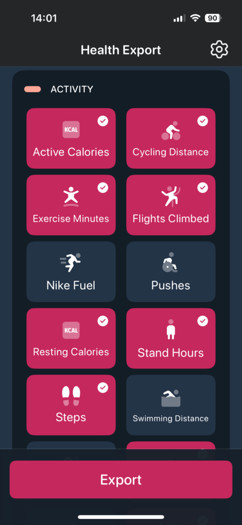
Given that the data exported via Apple’s Health app comes in a very JSON file, I used a separate app to download it from the App Store: Health App Data Export Tool.

In the app, I permitted it to access my health data and selected the CSV and Daily export type.

Then, I selected Activities to include in the exported CSV so I could eliminate empty columns in my data from the start.
Step 2: Data Cleaning Steps
- Replaced placeholders with NaN for proper missing value handling.
- Converted data types: Numeric columns have been cleaned and converted appropriately, including the handling of ranges by computing average values where applicable.
- Date conversion: The ‘Date’ column has been converted to datetime format for easier time-series analysis
Firstly, I’ll load some libraries that I’ll need.
# Load libraries
import numpy as np
import pandas as pd
import matplotlib.pyplot as plt
from sklearn.linear_model import LinearRegression
import plotly.express as px
import seaborn as sns
import plotly.offline
Next, I’ll import the data and do some simple data cleaning steps.
# Load the data from the CSV file
fitness_data = pd.read_csv("fitnessexport.csv")

# Display the first few rows of the dataframe to understand its structure
# fitness_data.head()# Replace '-' with NaN for cleaner handling of missing data
fitness_data.replace('-', np.nan, inplace=True)
## Remove unwanted columns
fitness_data.drop(columns = ['Body Temperature (degC)','Cardio Fitness (mL/min·kg)','Cycling Distance (km)'], inplace=True)Step 3: Predicting Heart Rate Variability (HRV) Values
I wanted to take a look at my Heart Rate Variability values over time and predict how they are going to be.
Using a simple linear regression model, I predicted that my HRV values will be going down in the coming months.
Here’s how I did it.
I created a function to split the string and strip the low and high HRV values, removing the dash between them and assigning them to two new Series in the DataFrame: Low HRV and High HRV.
# Convert 'Date' to datetime format
fitness_data['Date'] = pd.to_datetime(fitness_data['Date'], format='%d/%m/%y')


# Function to extract the low and high HRV values
def extract_hrv_values(hrv_value):
    try:
        if '-' in str(hrv_value):
            parts = hrv_value.split('-')
            low = float(parts[0].strip())
            high = float(parts[1].strip())
            return low, high
        value = float(hrv_value)
        return value, value
    except ValueError:
        return None, None  # Handle non-numeric and malformed entries

# Apply the function and create separate columns for low and high HRV
fitness_data[['Low HRV', 'High HRV']] = pd.DataFrame(fitness_data['Heart Rate Variability (ms)'].apply(extract_hrv_values).tolist(), index=fitness_data.index)

# Remove rows with NaN values
fitness_data = fitness_data.dropna(subset=['Low HRV', 'High HRV'])
I then created a numeric index to prepare the data for regression.
# Convert date to datetime and create a numeric index
fitness_data['Date'] = pd.to_datetime(fitness_data['Date'], errors='coerce')
fitness_data = fitness_data.dropna(subset=['Date'])
fitness_data['DateIndex'] = (fitness_data['Date'] - fitness_data['Date'].min()).dt.days
I then created linear regression models for both low and high data points for my HRV.
And then predicted them using the model.
# Prepare data for regression
X = fitness_data[['DateIndex']]
y_low = fitness_data['Low HRV']
y_high = fitness_data['High HRV']

# Fit linear regression models for low and high HRV
model_low = LinearRegression()
model_low.fit(X, y_low)
model_high = LinearRegression()
model_high.fit(X, y_high)

# Predict HRV values using the models
fitness_data['Low HRV Predicted'] = model_low.predict(X)
fitness_data['High HRV Predicted'] = model_high.predict(X)
I then extended the date range by 6 months to see the forecast over the next few days.
# Extend the date range by 6 months
last_date = fitness_data['Date'].max()
date_range_extension = pd.date_range(start=last_date, periods=6*30, freq='D')  # Assuming 30 days per month for simplicity

# Create DataFrame for the prediction period
future_dates = pd.DataFrame(date_range_extension, columns=['Date'])
future_dates['DateIndex'] = (future_dates['Date'] - fitness_data['Date'].min()).dt.days

# Predict HRV for the extended date range using the fitted models
future_dates['Low HRV Predicted'] = model_low.predict(future_dates[['DateIndex']])
future_dates['High HRV Predicted'] = model_high.predict(future_dates[['DateIndex']])

# Combine historical and future data
combined_data = pd.concat([fitness_data, future_dates])
I created a visual using Plotly to demonstrate interactivity so that it’s easy to mouse over to see what the predicted value is on a particular date.
# Create a plot using Plotly
fig = px.line(fitness_data, x='Date', y='Low HRV', title='Heart Rate Variability Trends Over Time')
fig.add_scatter(x=fitness_data['Date'], y=fitness_data['Low HRV Predicted'], mode='lines', name='Predicted Low HRV', line=dict(color='blue'))
fig.add_scatter(x=fitness_data['Date'], y=fitness_data['High HRV'], mode='lines', name='Actual High HRV', line=dict(color='green'))
fig.add_scatter(x=fitness_data['Date'], y=fitness_data['High HRV Predicted'], mode='lines', name='Predicted High HRV', line=dict(color='red'))
fig.update_layout(xaxis_title='Date', yaxis_title='HRV (ms)', legend_title='Data Type')

# Display the figure in a web browser
#fig.show(renderer="browser")
plotly.offline.plot(fig, include_plotlyjs=False, output_type='div')
Step 4: Time Series Analysis of Steps, Calories Burned, and Heart Rate
Before doing a time series analysis, I grouped the data by Date and calculated daily averages for Steps, Active Calories, and Resting Heart Rate.
# Convert columns that should be numeric; errors='coerce' will convert non-convertible values to NaN
numeric_columns = ['Active Calories (kcal)', 'Blood Oxygen (%)', 'Body Fat (%)',
    'Body Mass Index', 'Exercise Minutes', 'Flights Climbed (floors)',
    'Sleep', 'Stand Hours (hr)', 'Stand Minutes (min)', 'Steps (steps)',
    'Walking + Running (km)', 'Walking Heart Rate (bpm)', 'Walking Speed (km/hr)', 'Weight (kg)']

# Remove commas from numeric values and convert appropriate columns to float
for col in numeric_columns:
    fitness_data[col] = fitness_data[col].astype(str).str.replace(',', '')  # Remove commas
    if col in ['Steps (steps)', 'Walking Speed (km/hr)', 'Weight (kg)', 'Body Mass Index']:
        # Handle ranges by calculating the mean value
        fitness_data[col] = fitness_data[col].str.split('-').apply(
            lambda x: np.mean([float(i) for i in x]) if isinstance(x, list) else float(x) if x.isdigit() else np.nan
        )
    else:
        fitness_data[col] = pd.to_numeric(fitness_data[col], errors='coerce')

# Group the data by Date and calculate daily averages for Steps, Active Calories, and Resting Heart Rate
daily_averages = fitness_data.groupby('Date').agg({
    'Steps (steps)': 'mean',
    'Active Calories (kcal)': 'mean',
    'Resting Heart Rate (bpm)': lambda x: pd.to_numeric(x, errors='coerce').mean()
}).reset_index()
Here are the daily averages for each metric within the accurate date range from January 2023 to April 2024:
- Average Daily Steps: Displays the smoothed daily average of the steps I took.
- Average Active Calories Burned: This shows how many calories I burned on average each day due to physical activity.
- Average Resting Heart Rate: Provides insights into my average daily resting heart rate, an important indicator of your heart health.
I then visualised the data using matplotlib.
# Plotting the daily averages with the corrected date range
plt.figure(figsize=(14, 7))

plt.subplot(3, 1, 1)
plt.plot(daily_averages['Date'], daily_averages['Steps (steps)'], label='Average Daily Steps', color='blue')
plt.title('Average Daily Steps')
plt.ylabel('Steps')

plt.subplot(3, 1, 2)
plt.plot(daily_averages['Date'], daily_averages['Active Calories (kcal)'], label='Average Active Calories Burned', color='red')
plt.title('Average Active Calories Burned')
plt.ylabel('Calories')

plt.subplot(3, 1, 3)
plt.plot(daily_averages['Date'], daily_averages['Resting Heart Rate (bpm)'], label='Average Resting Heart Rate', color='green')
plt.title('Average Resting Heart Rate')
plt.ylabel('Heart Rate (bpm)')

plt.tight_layout()
plt.show()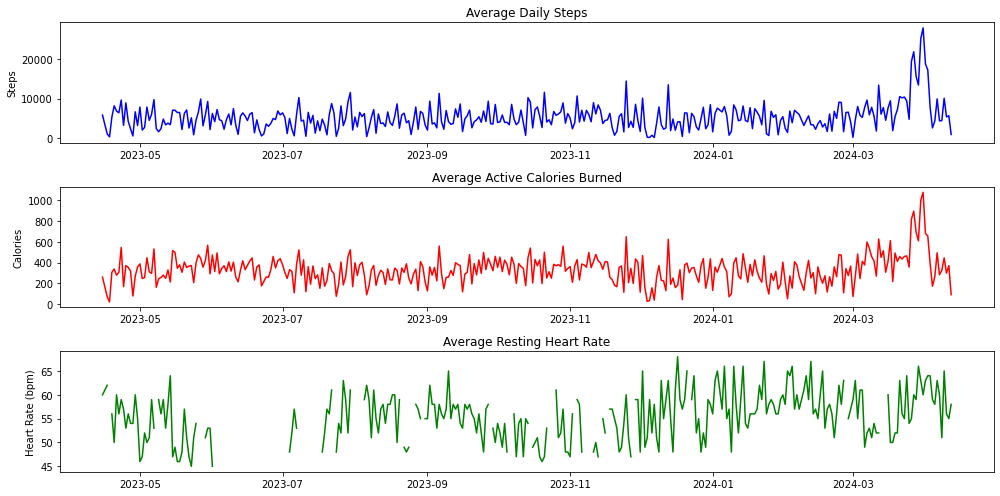
The spike in steps, calories burned, and heart rate near the end of March coincided with the time I was overseas, which accounted for the high number of steps I took while walking around.
Step 5: Analysing Weekend vs Weekday Step Trends
I wanted to see if there’s a difference in my steps on the weekends.
I typically work from home on weekdays and go out more often on the weekends.
Based on my guess, I’d have more steps on the weekends.
Let’s see if the data reflects this lifestyle.
# Add a column to determine if the date is a weekday or weekend
fitness_data['Day Type'] = fitness_data['Date'].dt.dayofweek.apply(lambda x: 'Weekend' if x > 4 else 'Weekday')

# Calculate the mean for steps, active calories, resting heart rate, and walking speed grouped by day type
weekday_weekend_comparison = fitness_data.groupby('Day Type').agg({
    'Steps (steps)': 'mean',
    'Active Calories (kcal)': 'mean',
    'Resting Heart Rate (bpm)': lambda x: pd.to_numeric(x, errors='coerce').mean(),
    'Walking Speed (km/hr)': 'mean'
}).reset_index()

# Optional: Plot the results for a visual comparison
plt.figure(figsize=(8, 8))
plt.bar(weekday_weekend_comparison['Day Type'], weekday_weekend_comparison['Steps (steps)'], color='#76b5c5', width=0.4)

# Adding data labels
for bar in bars:
    yval = bar.get_height()
    plt.text(bar.get_x() + bar.get_width()/2, yval, round(yval, 1), ha='center', va='bottom')

plt.xlabel('Day Type')
plt.ylabel('Average Steps')
plt.title('Average Steps: Weekday vs Weekend')
plt.show()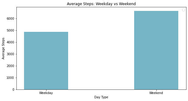
Step 6: Analysis of Workout Types
I wanted to find out what types of workouts I do most often.
So, a simple bar plot will do.
This time, I’ll demonstrate it using a countplot in Seaborn.
CleanWorkoutType = fitness_data.dropna(subset = ['Workout Type'])


# Specifying the order based on frequency
order = CleanWorkoutType['Workout Type'].value_counts().index


# Define a custom palette of orange shades
orange_palette = sns.light_palette("orange", n_colors=len(order), reverse=True)

# Automatically calculate space above the highest bar to prevent overlap with labels
max_height = max(CleanWorkoutType['Workout Type'].value_counts())

# Create a countplot using Seaborn
ax = sns.countplot(x='Workout Type', data=fitness_data, dodge=True, order=order, palette=orange_palette)
plt.title('Distribution of Workout Types')

# Add labels to each bar
for p in ax.patches:
    ax.annotate(format(p.get_height()),  # The label text (count in this case)
                (p.get_x() + p.get_width() / 2., p.get_height()),  # Position
                ha = 'center',  # Center alignment
                va = 'center',  # Center vertically
                xytext = (0, 8),  # Position text 10 points above the bar
                textcoords = 'offset points')

# Adds 50 as padding above the highest bar
ax.set_ylim(0, max_height + 50)

plt.xticks(rotation=90)  # Rotate labels if they overlap or are too long
plt.show()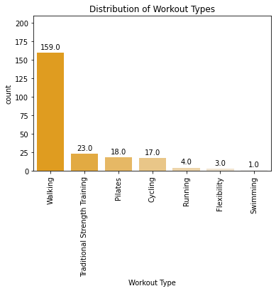
That’s it!
Learnings From This Analysis
After all this analysis, what are the insights?
Firstly, I’ve learnt that my Heart Rate Variability (HRV) is on a slow downward trend.
That’s not too good, as a higher HRV is related to a better response to changes, both physically and mentally.
I’ll need to work on techniques to raise it.
Secondly, I spend way more time walking around on weekends than on weekdays.
While hanging out and walking more on the weekends, I need to find a way to clock in some steps on weekdays too.
That could mean going for a short walk in the evenings or heading to the gym during lunchtime.
Thirdly, most of my workouts consist of walks.
Yes, while not that totally a bad thing, this might not be intense enough for me.
I need to do further analysis and see the exercise minutes for each workout rather than the frequency.
Thanks for looking through this portfolio project in Python.
This project is part of my full portfolio.
You’ll find more about me there.
Cheers,
Justin